Hey there! Today, we’re diving into the art of creating a cohesive color scheme for your home. Whether you’re revamping your living room, redesigning the kitchen, or simply adding a fresh coat of paint to your walls, choosing the right colors can make all the difference in creating a harmonious and inviting space.

Why Creating a Cohesive Color Scheme and Color Palette is Important
Before we dive into the nitty-gritty of selecting colors, let’s talk about why having a cohesive color palette is so important. A well-thought-out interior design color palette sets the tone for your entire home, creating a sense of unity and harmony that ties everything together. Imagine walking through a home where every room flows seamlessly into the next, each space complementing the overall aesthetic—this is the power of a carefully curated color palette.
Not only does creating a cohesive color scheme enhance the visual appeal of your home, but it also impacts how you and your guests feel in each space. Colors have the ability to evoke emotions and set moods—whether it’s a calming bedroom retreat, an energizing kitchen hub, or a cozy living area for relaxation. By choosing colors that resonate with your style and personality, you can create environments that not only look beautiful but also feel comfortable and welcoming.
Now, let’s explore how you can craft your own perfect interior design color palette step by step.
Step 1: Identify Your Style and Vision
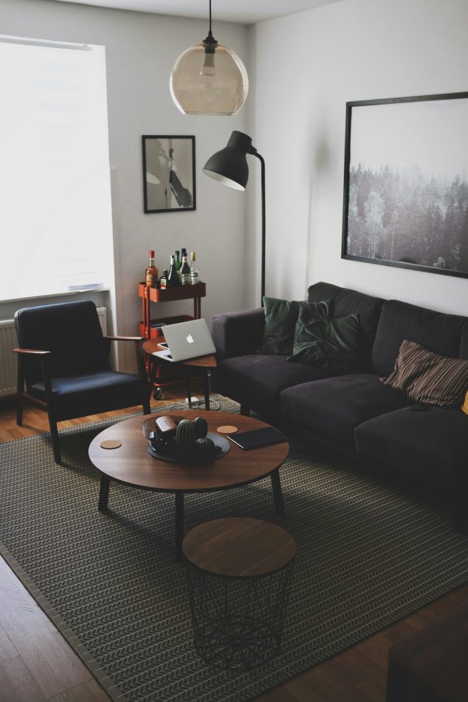
The first step in crafting a beautiful interior design color palette is to identify your style and vision for your home. Are you drawn to modern minimalism, cozy rustic vibes, or perhaps something vibrant and eclectic? Understanding your preferred aesthetic will guide your color choices and ensure they reflect your personality.
For example, I personally love earth tones and neutrals. They create a warm and inviting atmosphere while providing a versatile backdrop for different decor styles. Imagine walking into your dream home—what colors do you see? Soft neutrals that evoke tranquility, or bold hues that make a statement? Take inspiration from your surroundings, favorite decor styles, and even nature itself. This vision will serve as the foundation for your color journey.
Tip: If you don’t know where to start, browse the internet for inspiration (Hello, Pinterest!)
Step 2: Choose a Dominant Color
Now, let’s talk about the star of your interior design color palette: the dominant color. This is the hue that will set the tone for your entire space, anchoring the look and feel you want to achieve. Whether it’s a soothing shade of blue, a timeless gray, or a warm earth tone, your dominant color will dictate the mood of the room. Your dominant color can be used as the primary wall paint color, creating a solid foundation for your design.
Alternatively, you can choose two dominant colors that work well together. This adds an extra layer of depth and interest to your color scheme, allowing for more creativity and versatility.
When selecting your dominant color, consider factors such as natural light, room size, and existing furnishings. Opt for a color that complements your lifestyle and enhances the functionality of the space. Remember, this is your chance to create a backdrop that speaks volumes about your home’s personality.
Step 3: Select Supporting Colors
With your dominant color in place, it’s time to bring in supporting characters that will complement and elevate your interior design color palette. Think of these as the supporting actors in a blockbuster film—they may not steal the spotlight, but they certainly add depth and dimension to the storyline.
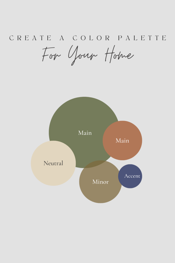
Choose 2-3 additional colors that harmonize with your dominant hue. These can be shades that are lighter or darker variations, or even contrasting colors that create visual interest. If you have chosen two dominant colors, your supporting colors must work well with both of them, creating a cohesive and balanced look.
For instance, if your dominant color is a serene green, consider pairing it with accents of crisp white and hints of golden yellow to create a refreshing atmosphere. The key is to ensure that these supporting colors enhance and complement your dominant choices, adding layers of visual appeal.
Tip: If you need help coordinating colors, you can use this free color palette generator! You can search trending palettes, OR upload a photo to generate a palette from.
Step 4: Consider Color Flow
Creating a cohesive color scheme isn’t just about individual rooms—it’s about how those rooms flow together within your home. As you move from one space to another, you want the transition to feel natural and seamless, like chapters in a well-written novel.
Pay attention to how colors interact in adjacent rooms and hallways. Aim for a balanced distribution of hues throughout your home, ensuring that each area complements the next without overwhelming the overall aesthetic. This mindful approach will create a sense of unity and continuity that ties your entire home together.
Step 5: Test and Adjust
Before committing to your interior design color palette, it’s essential to test your chosen colors in different lighting conditions and against existing decor elements. Colors can appear differently under natural daylight versus artificial lighting, so take your time to observe how they behave throughout the day.
Consider painting small swatches on walls or using color samples to visualize the impact of your choices. This hands-on approach allows you to make adjustments as needed, ensuring that you achieve the desired look and feel before diving into full-scale implementation.
Implementation After Creating a Cohesive Color Scheme
Now that you’ve crafted the perfect interior design color palette for your home, it’s time to bring your vision to life! Here are practical steps to implement your new color scheme across different areas:
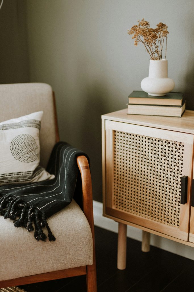
Paint and Wall Coverings: Start by painting walls in your dominant color, using supporting colors for accents or feature walls. Consider textured finishes or wallpapers to add depth and character to each room. Generally, the dominant color should make up about 60% of the room’s color scheme. This creates a balanced and inviting backdrop for your space.
Furniture and Upholstery: Select furniture pieces that complement your interior design color palette. Upholstery and soft furnishings, such as cushions and throws, can introduce additional hues or provide contrast against your chosen colors. Your supporting colors should account for around 30% of the room’s color scheme, adding depth and variety without overwhelming the space.
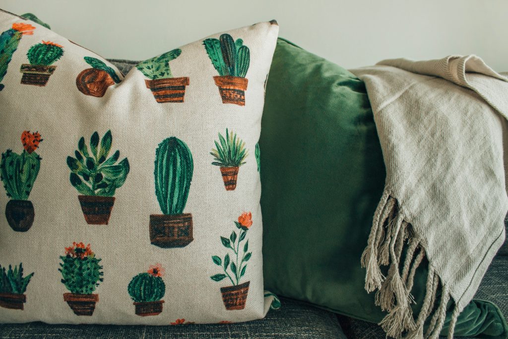
Textiles and Decorative Accents: Integrate textiles like curtains, rugs, and pillows that echo your color scheme. These elements not only tie rooms together but also add warmth and texture to your living spaces. Use accent colors for the remaining 10%, bringing in pops of color that highlight and enhance your dominant and supporting hues.
Lighting and Accessories: Choose lighting fixtures and accessories that harmonize with your interior design color palette. Lighting can influence how colors are perceived, so opt for fixtures that enhance the overall ambiance of your home.
Evaluate and Adjust: Throughout the implementation process, step back periodically to assess the overall effect of your color scheme. Make any necessary adjustments to maintain balance and harmony across all areas of your home.
Have Fun Curating Your Cohesive Color Scheme!
Creating a cohesive color scheme for your home is all about expressing your personal style and creating spaces that resonate with you and your family. By following these steps and embracing your creativity, you’ll transform your living spaces into a harmonious sanctuary that reflects your unique vision. Happy decorating!
You May Also Like:
How to Design a Gallery Wall: Tips and Tricks For a Stunning Look
Transforming Our Kids Playroom: Our Paint Colors

Leave a Reply